Client
Year
2018
Services
- Concept Strategy
- Concept Design
- Concept Execution
Reintroducing Kronos, through branding and store renovation.
Since 1929, Kronos ice cream, with the same care and passion, produces and offers daily fresh artisanal ice creams.
From 2 brothers that immigrated from Turkey to Greece and then moved to Chios island, Theofanides family offers handcrafted products, becoming a landmark both for the locals and visitors of the ice cream. Today, the grandson Georgios Theofanides keeps the business running, driven by the practices that the company’s founders have always followed, to deliver good ice cream. This year, the owner decided to relaunch the brand, with new branding, brand identity and a store renovation.
The project
In the initial stage, we defined the brand strategy following a holistic design thinking, upon which all next steps were based. The second phase included the creation of the concept and branding, with the incorporation of the architectural and operational design. Additionally, our branding services included the creation of all branding applications, starting with the logo redesign. All elements were aligned to create a robust brand identity and a unique environment for all clients.
The logo was kept same for several years, and it was decided that it should get modernized, as well as the whole identity. The name Kronos means the Saturn, the sixth planet from the sun and second-largest in the solar system. The name of the brand was selected to be this as it is known to be the coldest planet in the galaxy. While redesigning the logo, the main elements of the existing logo were kept, while creating a more contemporary image. The years of establishment pair the logo, to promote the heritage and the long presence, as well as an explanatory tagline to inform that the brand offers exquisite ice-creams. As a result, in the new logo created, the recognizable mark of the planet, well established in the mind of customers was decided to be updated and not just extinct. The “o”s in the name of the logo represent the planets whereas the date of establishment works as a satellite.
A minimal approach was followed for the logo redesign, while the brass colour used to indicate the handmade products, with an association to the utensils used to create the ice-cream. Additional elements of the logo are the characteristic font used and a pattern designed. The font is very special and the K, even in the English version of the logo reminds of the Greek «Κ». A pattern is also designed to accompany the logo in different applications, where the Greek origin of the brand is also promoted.
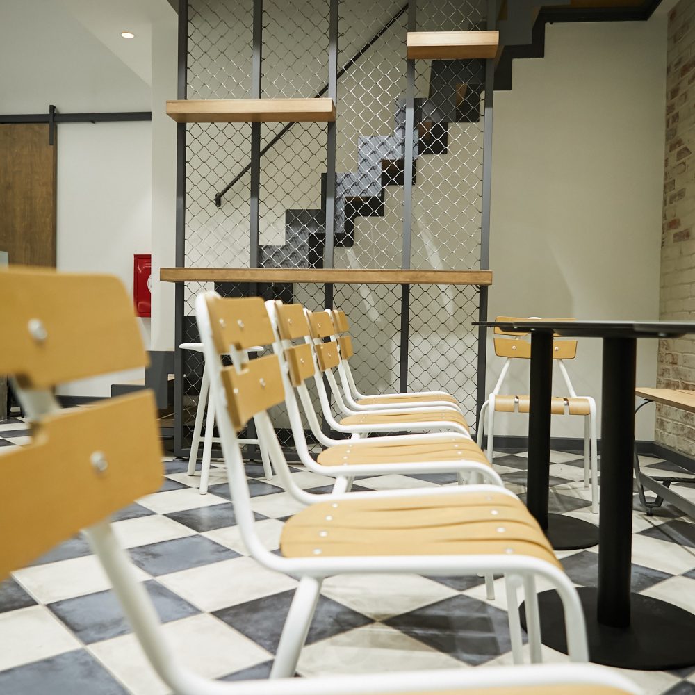
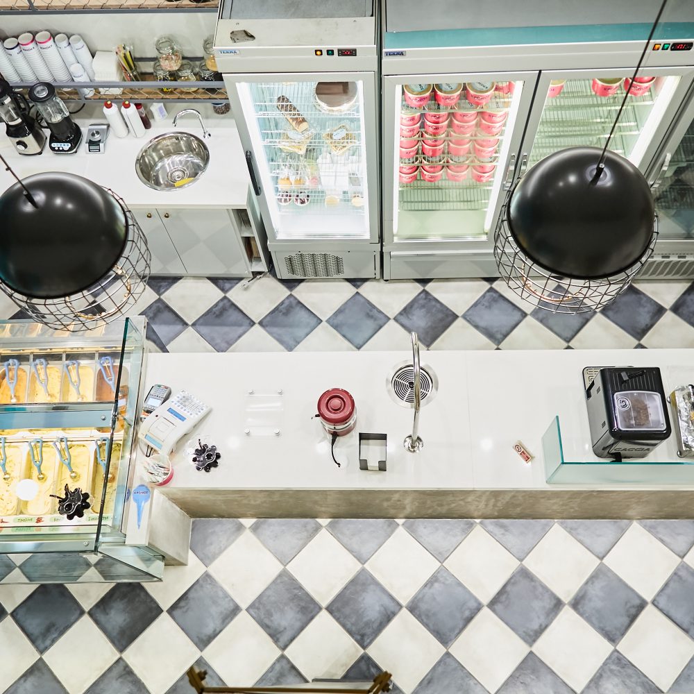
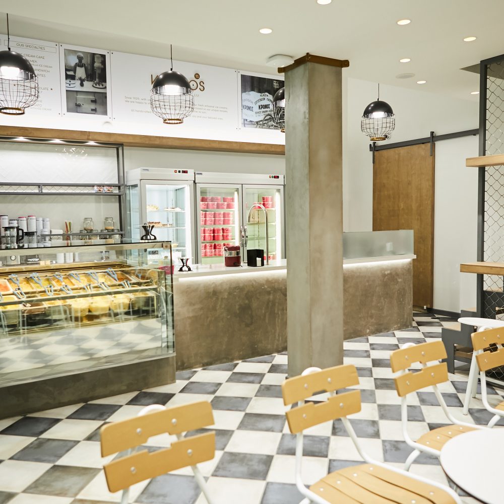
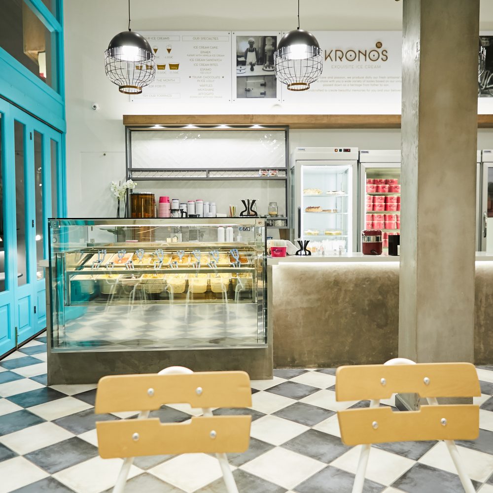
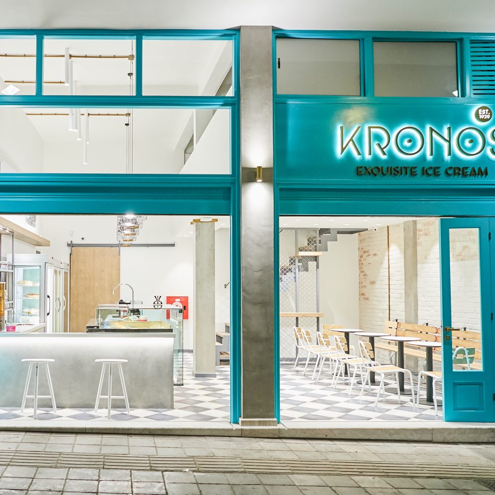
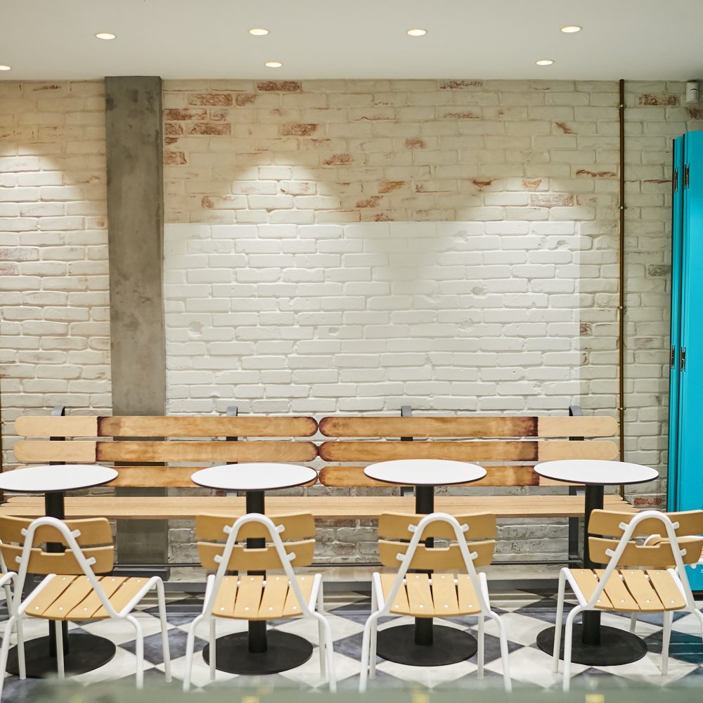
Apart from the logo and identity redesign, the store was also reformed. Tiles and wood from the previous format of the store are kept indicating the long presence of the store and the care. The store now showcases an upgraded customer experience, enabling fast service, solving functionality and cross-selling opportunities. The products are showcased and starified, additional products have been added to the menu, while the area where customers can enjoy the products is more welcoming, comfortable and vibrant. The intense blue color selected is happy and vibrant, making a nice contrast with the colorful products.
The overall ambiance is open, neat and lively and creates a modern and friendly atmosphere, while all features of the space enhance the distinct and recognisable brand identity. The store now operates in the new environment, and the visitors have well received the change. The results are reflected also in the sales, that are doubled within few months.

