STIRIXIS Group receives the “Excellent Communications Design-Brand Identity” award for its project Kronos Exquisite Ice-cream, by the German Design Council in Frankfurt, Germany. At the festive ceremony, Niovi Pontillo, the Marketing Manager of STIRIXIS Group, received the prestigious award.
A great award for a great logo!
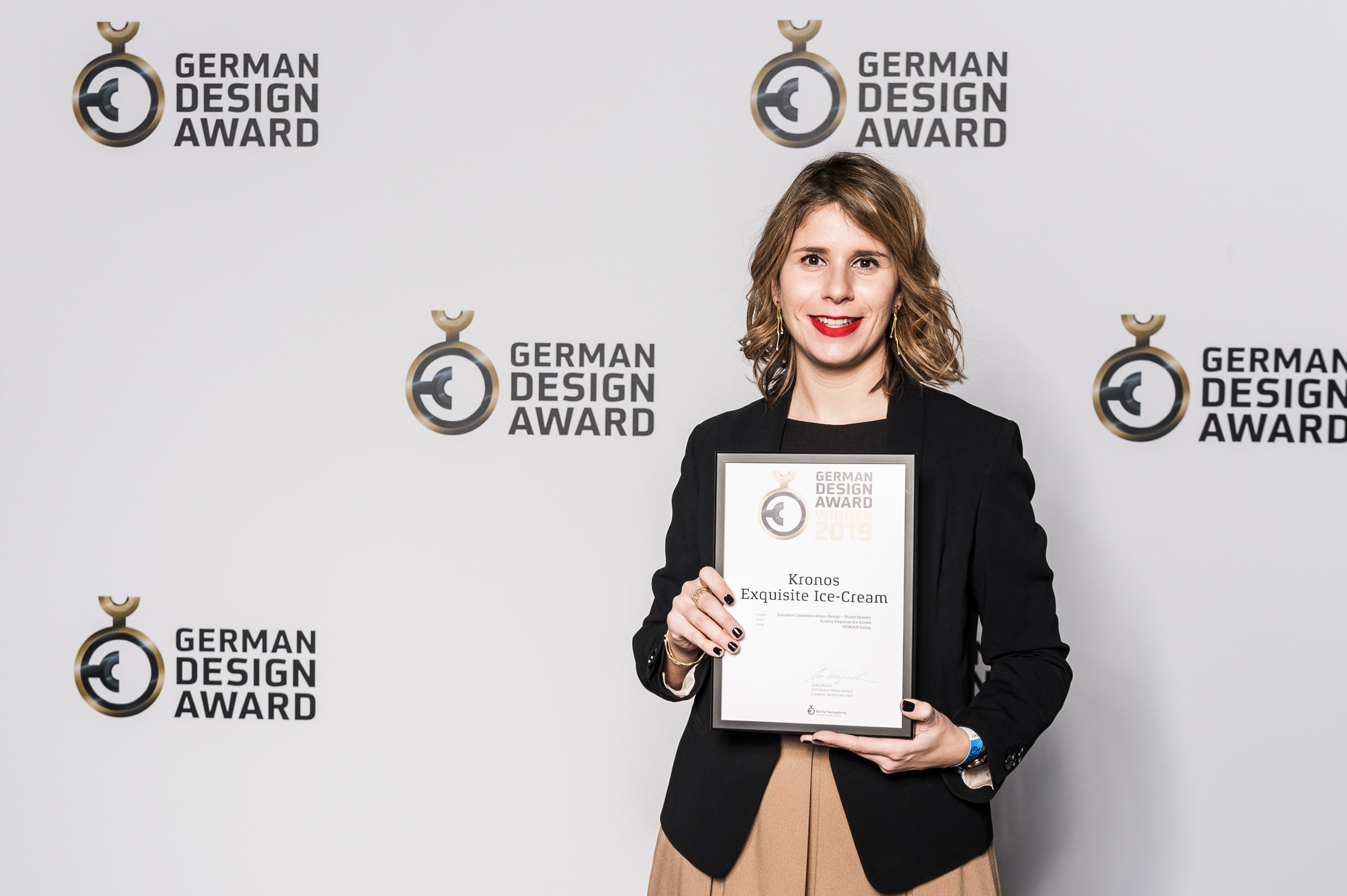
The German Design Awards are the international premier prize awarded by the German Design Council. Its goal is to discover, present, and honour unique trends in design. Every year, high-calibre entries in the fields of product and communication design are honoured, each of which blazes new trails in the international design landscape. STIRIXIS Group participated for the first time in the competition and the award is a recognition for the high level of services offered in the logo design, and branding identity development.

Kronos Exquisite Ice-cream is a representative example of our holistic approach delivered to our clients. From the definition of the brand strategy, upon which all next steps were based, to the formation of the complete brand identity and the entire renovation of the store, following the further evolution of the concept and the development of the brand.
The logo was kept the same for several years, and it was decided that it should get modernized, as well as the whole identity. The name Kronos means the Saturn, the sixth planet from the sun and second-largest in the solar system. The name of the brand was selected to be this as it is known to be the coldest planet in the galaxy.
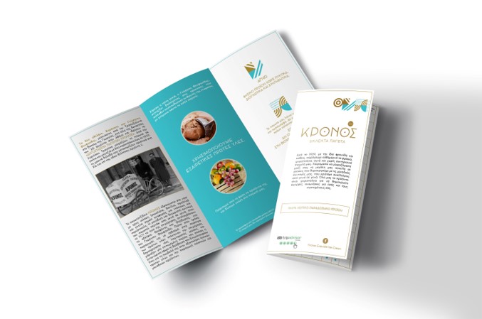
While redesigning the logo, the main elements of the existing logo were kept, while creating a more contemporary image. The years of establishment pair the logo, to promote the heritage and the long presence, as well as an explanatory tagline to inform that the brand offers exquisite ice-creams. As a result, in the new logo created, the recognizable mark of the planet, well established in the mind of customers was decided to be updated and not just extinct. The “o”s in the name of the logo represent the planets whereas the date of establishment works as a satellite. A minimal approach was followed for the logo redesign, while the brass colour used to indicate the handmade products, with an association to the utensils used to create the ice-cream.
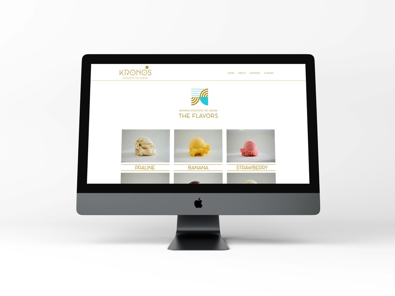
Τhe new identity is applied to all the brand’s applications such as to the cups and napkins, the employees’ aprons, the store’s brochure, the leaflet, the menu, and the business cards, but also to the new Website created. Moreover, the new identity is harmonically placed in the renovated store and the environmental graphics applied.
To find out more about the project, click here.


