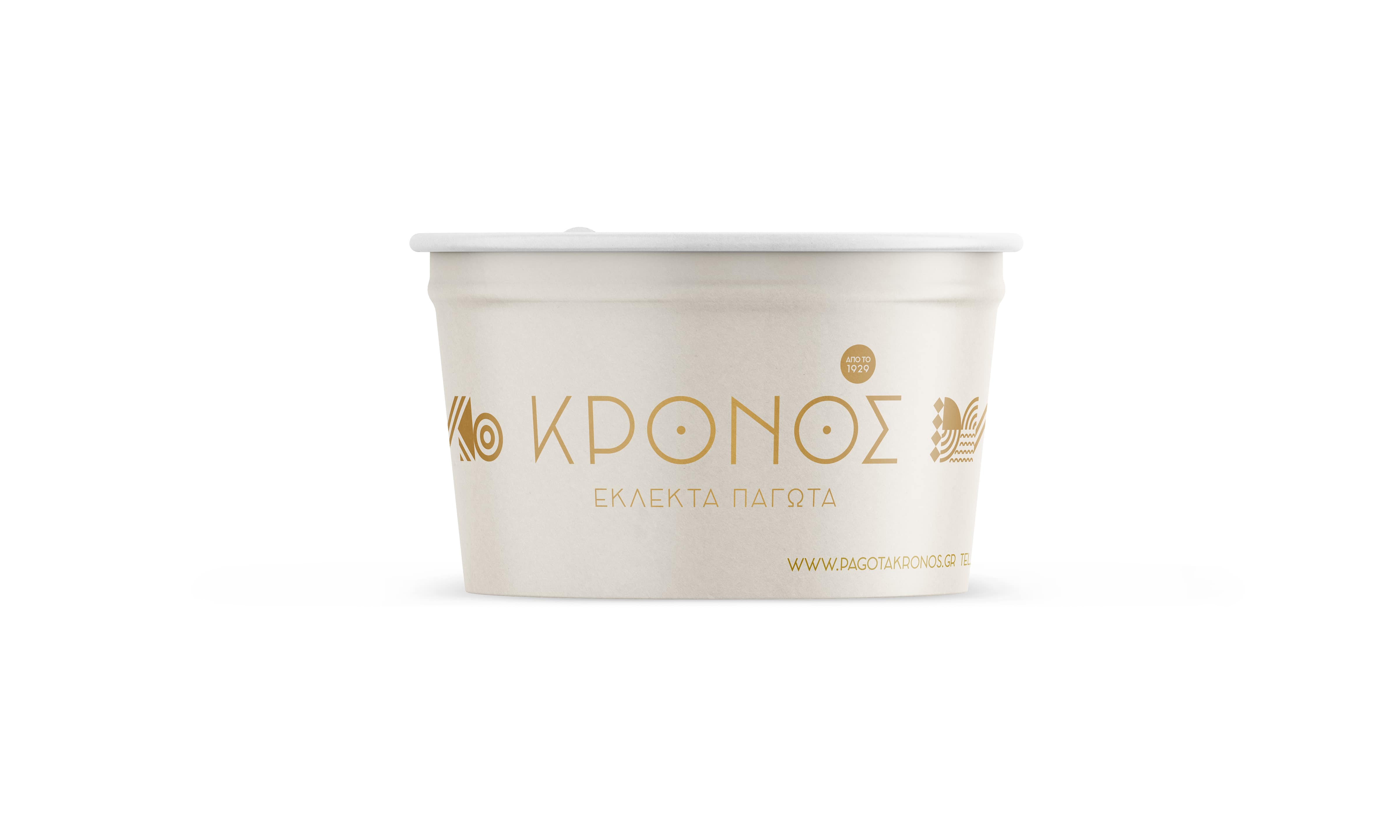
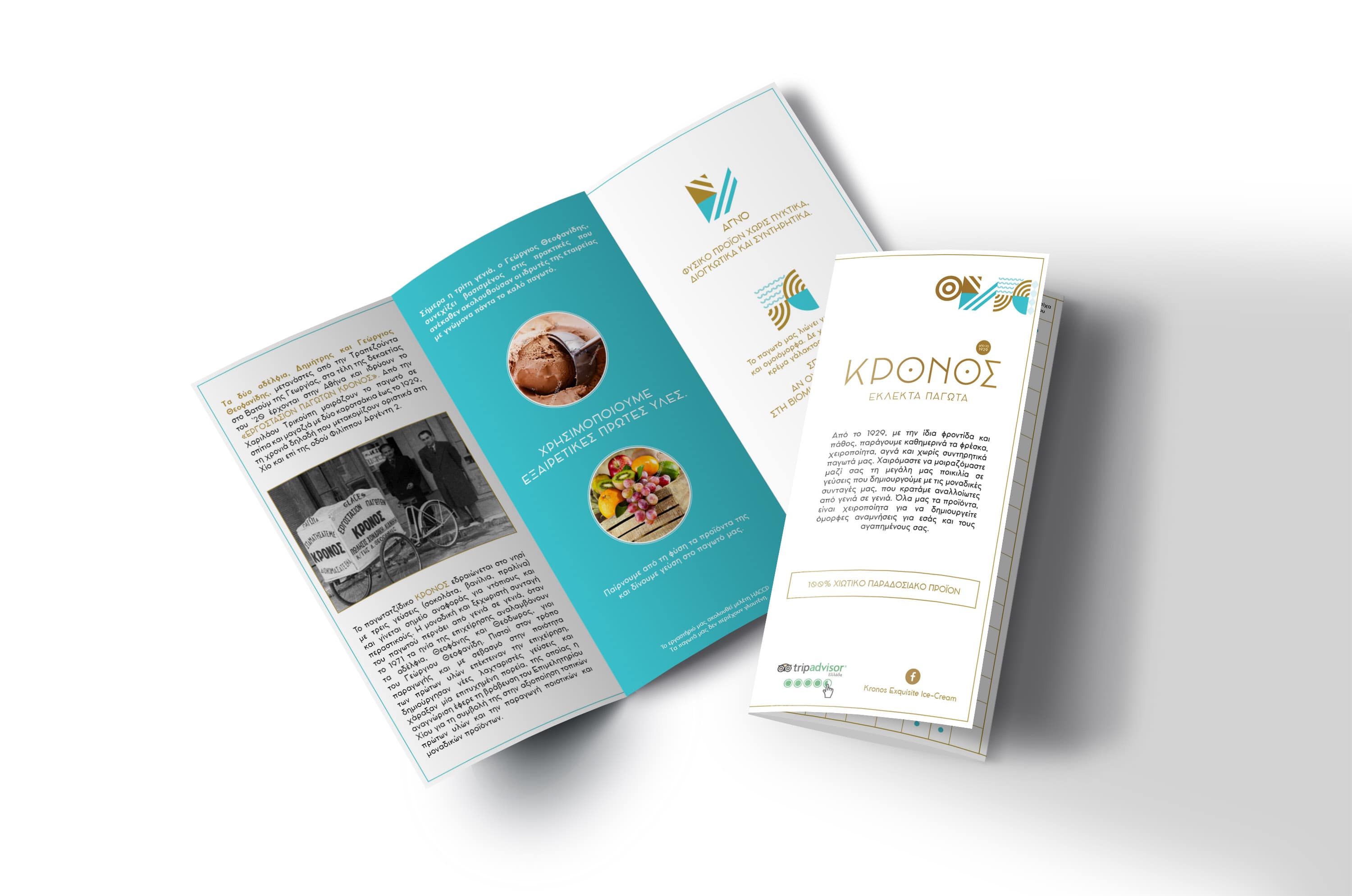
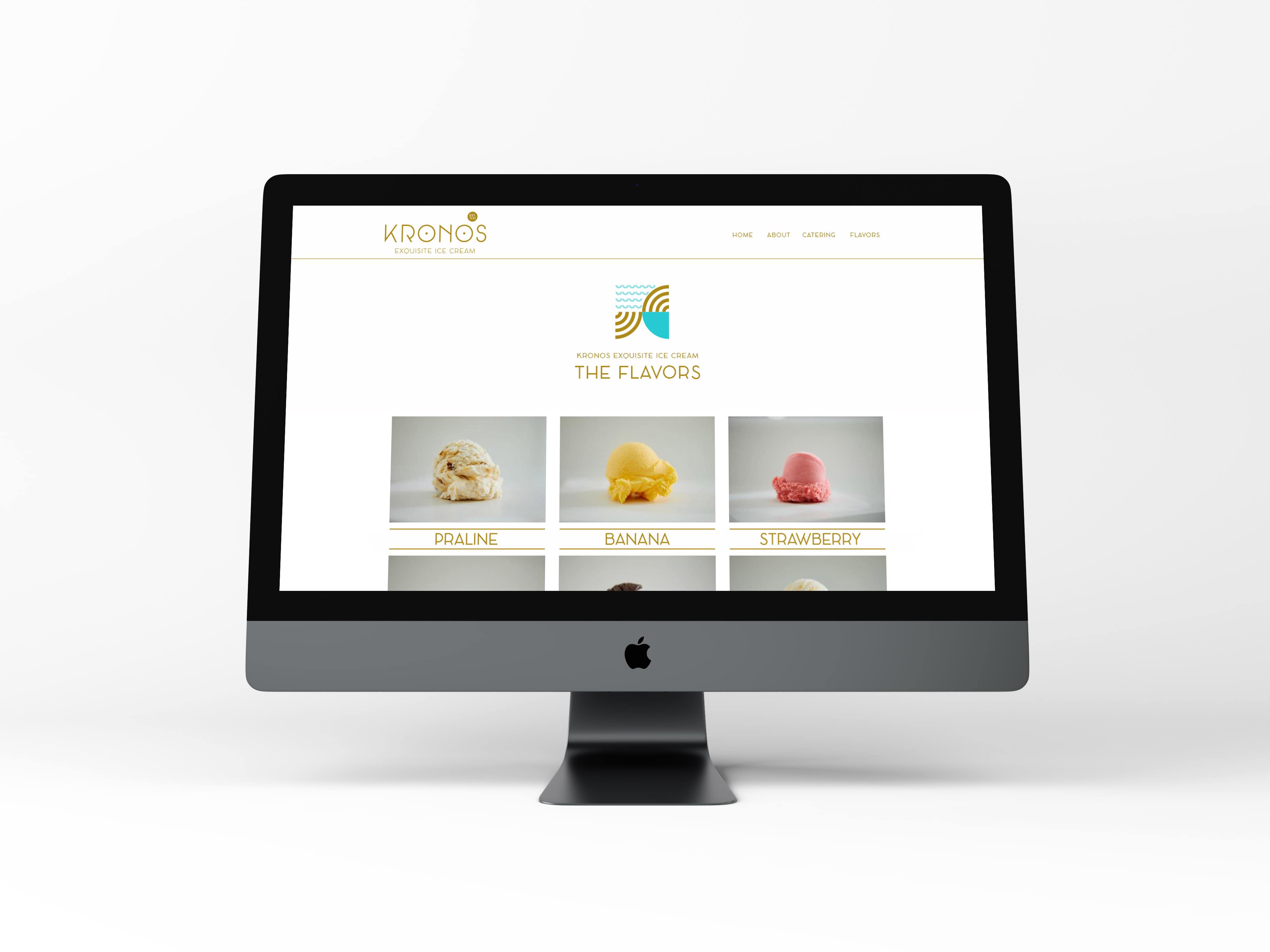
The logo was kept same for several years, and it was decided that it should get modernized, as well as the whole identity. The name Kronos means the Saturn, the sixth planet from the sun and second-largest in the solar system. The name of the brand was selected to be this as it is known to be the coldest planet in the galaxy. While redesigning the logo, the main elements of the existing logo were kept, while creating a more contemporary image. The years of establishment pair the logo, to promote the heritage and the long presence, as well as an explanatory tagline to inform that the brand offers exquisite ice-creams. As a result, in the new logo created, the recognizable mark of the planet, well established in the mind of customers was decided to be updated and not just extinct. The “o”s in the name of the logo represent the planets whereas the date of establishment works as a satellite.
A minimal approach was followed for the logo redesign, while the brass colour used to indicate the handmade products, with an association to the utensils used to create the ice-cream. Additional elements of the logo are the characteristic font used and a pattern designed. The font is very special and the K, even in the English version of the logo reminds of the Greek «Κ». A pattern is also designed to accompany the logo in different applications, where the Greek origin of the brand is also promoted.


